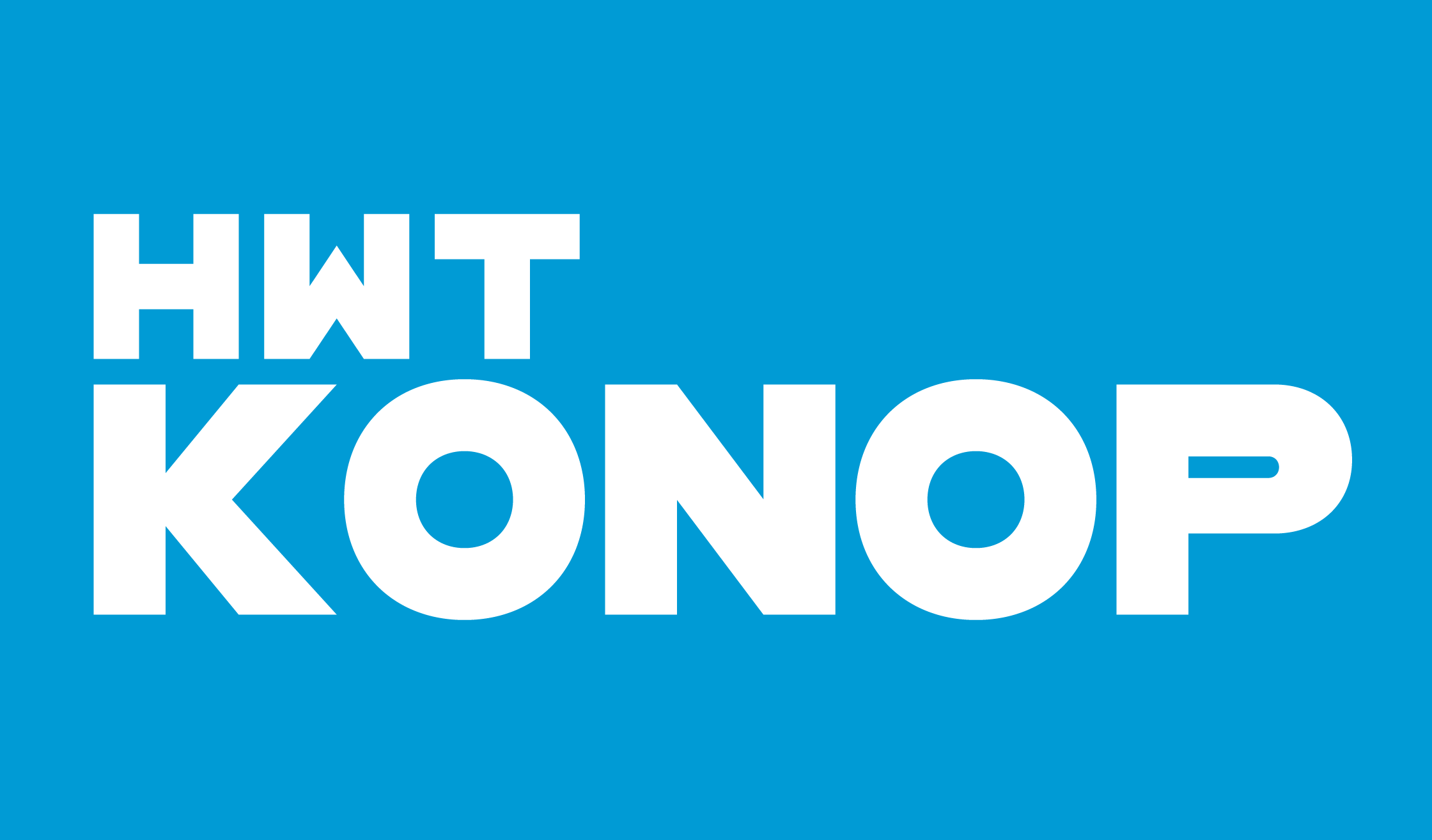
HWT Konop
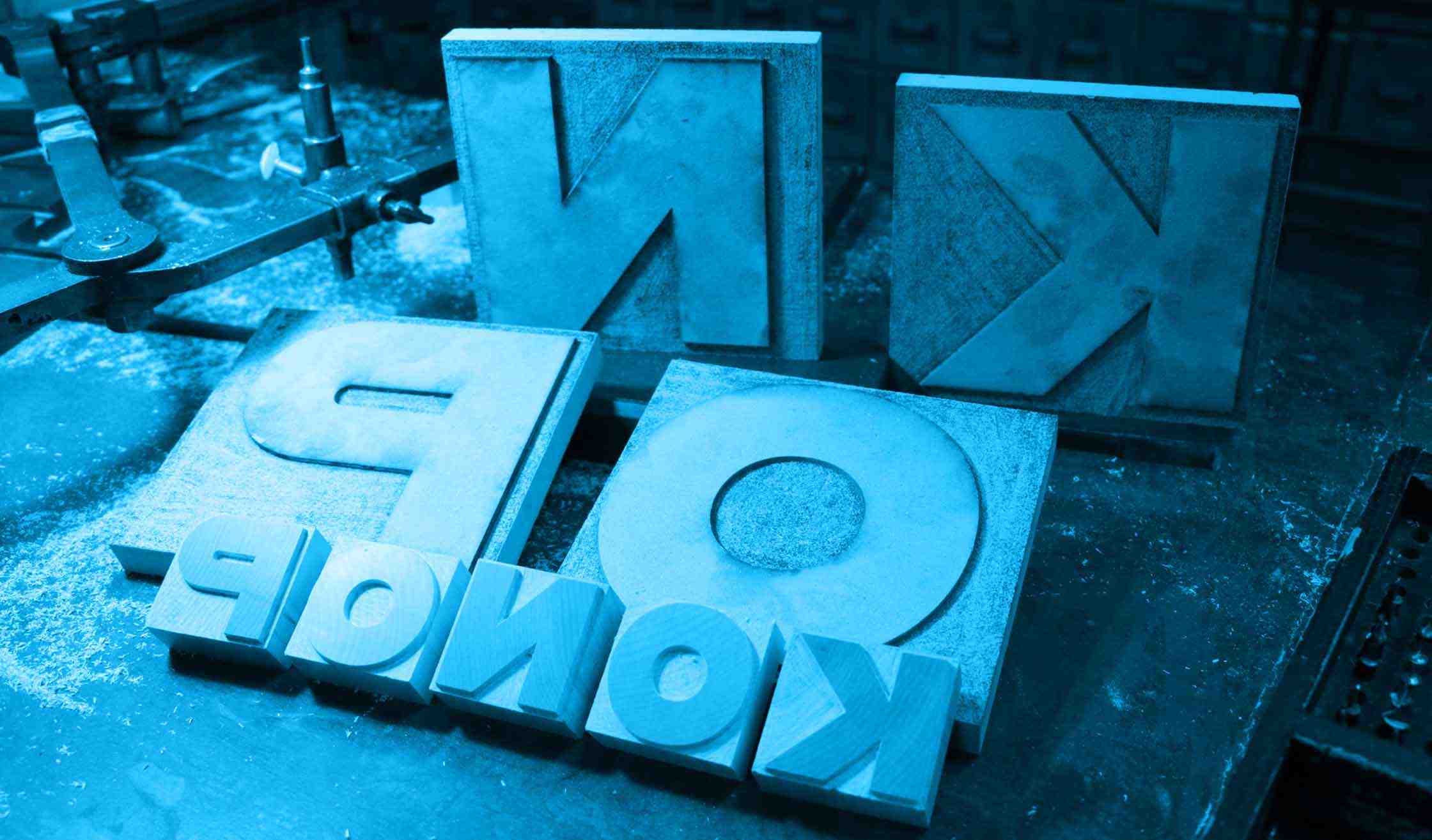
HWT Konop (2018) is an original wood type design I created for the Hamilton Wood Type & Printing Museum as part of The Hamilton Wood Type Legacy Project. The wood type is currently in production and not available yet, but a digital version is available through P22. It’s named after Don Konop, a retired Hamilton Manufacturing employee, who worked there from 1959 to 2004, and serves on the Two Rivers Historical Society Board.
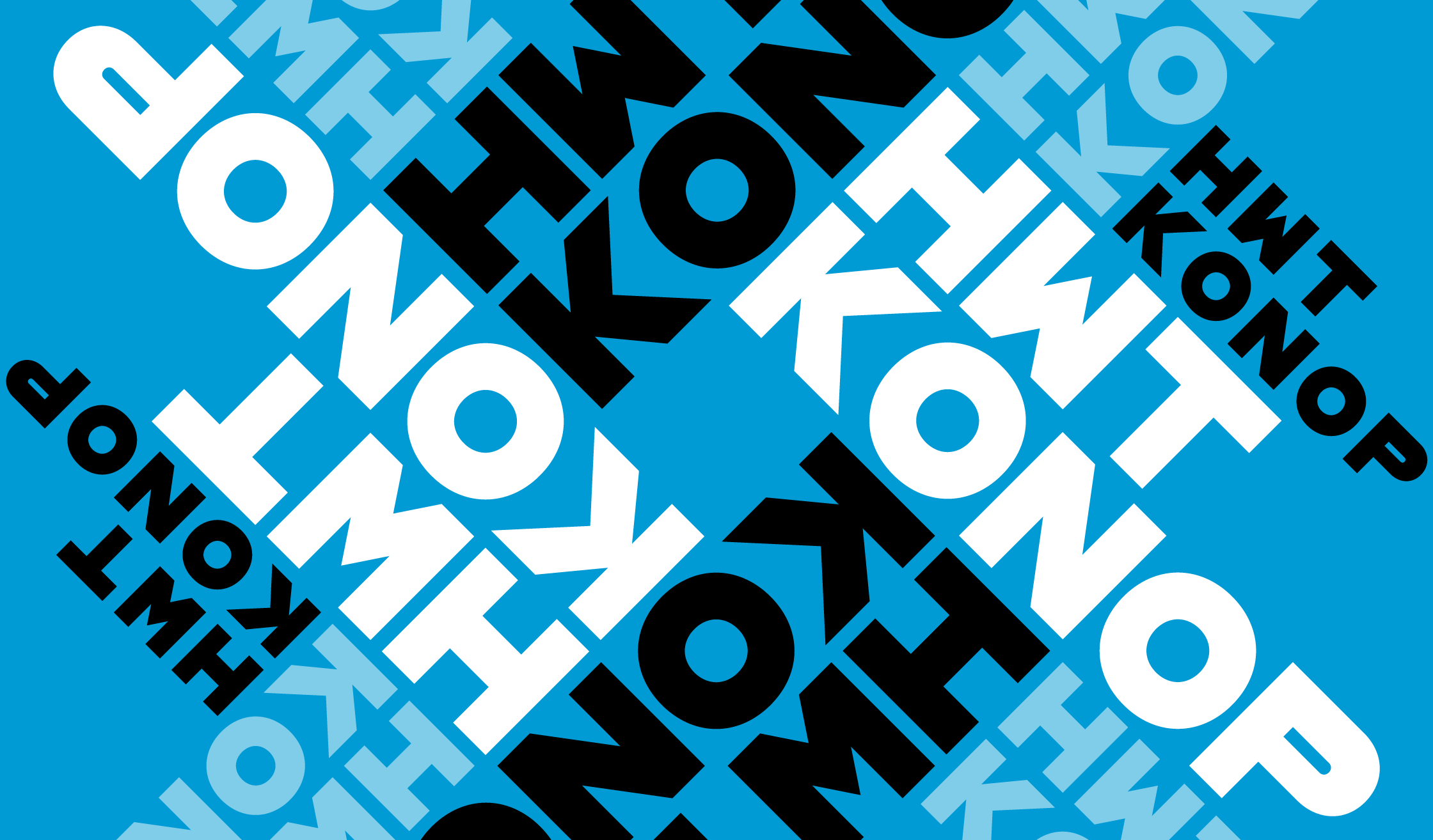
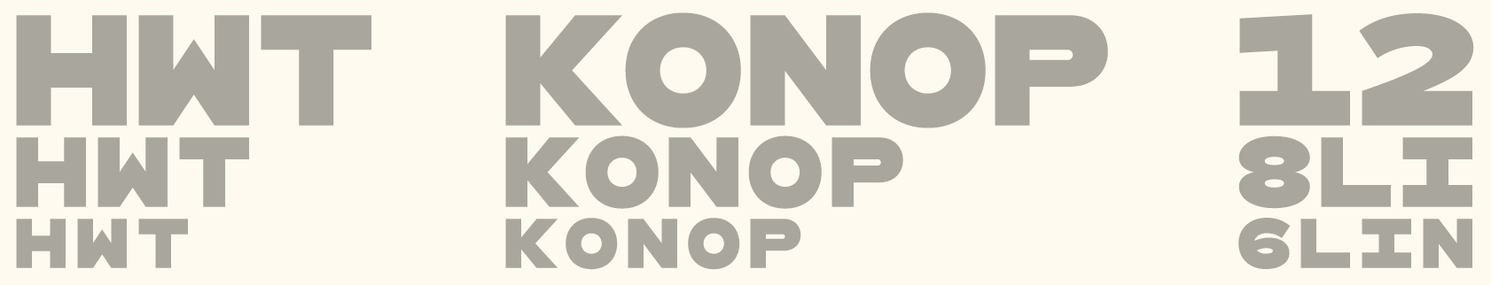
HWT Konop is a monospaced (fixed-width) typeface that is also square, so that characters can be arranged horizontally or vertically in any orientation. To a traditional letterpress job printer, a font like this wouldn’t make much sense. But to a modern letterpress printer, who is typically more interested in visual expression, it is an unusual and creative design toolkit.
Its bold gothic style is similar to traditional gothic wood types, but more geometric. Since the characters may be used in any orientation, some of the standard optical adjustments, such as making verticals thicker than horizontals and making tops smaller than bottoms, have been omitted. This results in a quirky but charming design.
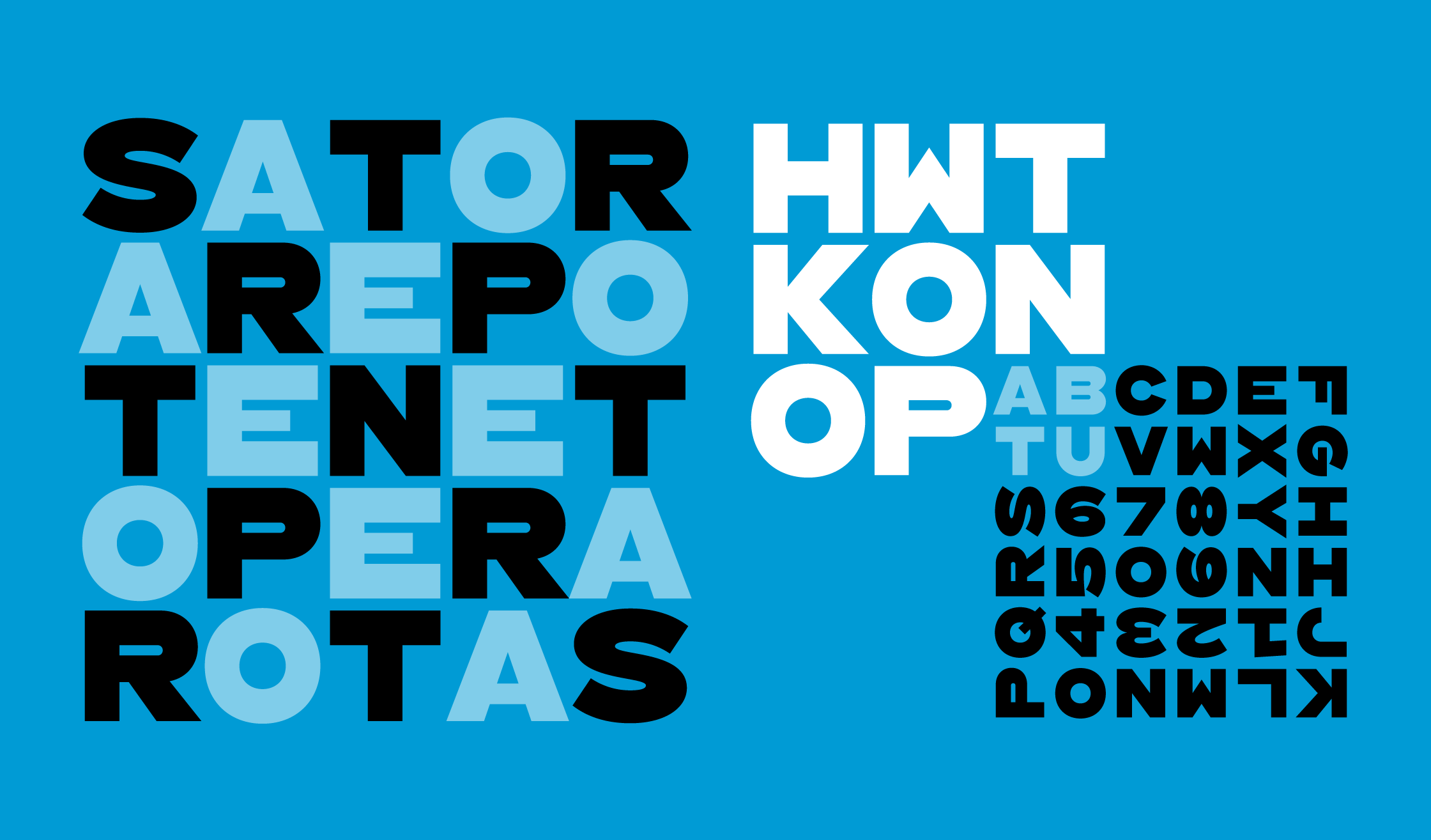
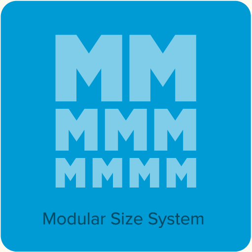
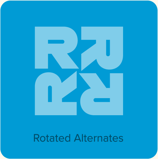
The digital version of Konop replicates the wood type version as much as possible, including three different size designs: 12 Line, 8 Line, and 6 Line. By setting these styles proportional to one another, in a 2 to 3 to 4 size ratio, the edges of the characters will stay perfectly aligned. Konop also includes OpenType stylistic sets that allow characters to be rotated in place, 90° left, 90° right, or 180°, just like the wood type version. Because Konop is a monospaced design, there is naturally no pair kerning.
HWT Konop has a limited character set (mainly caps, numbers, punctuation, and a few symbols), but contains more characters than the wood type version. Because of the nature of the design, which is meant too set with no space between lines, no accented characters are included. (Sorry.)
You can learn more about HWT Konop from the Digital Konop User Guide (58k PDF). I also wrote an a piece about it on my blog with some additional background information.
100% of my royalties for sales of HWT Konop go to the Hamilton Wood Type & Printing Museum in Two Rivers, Wisconsin. It’s a unique treasure and home to the largest collection of wood type in the world. I highly recommend a visit if you are interested in type or printing.
Weights & Styles

Features
- Monospaced (fixed-width).
- Characters are designed on a square body, so they may be set in any direction or orientation.
- Three size designs: 12 Line, 8 Line, and 6 Line, corresponding to the wood type version.
- Rotated alternate characters, allowing characters to be rotated in place.
- Limited character set: Caps, figures, punctuation, and symbols. Note: Does not include accented characters.
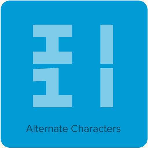
- Half-width characters for punctuation, plus half-width alternate capital I and figure 1.
- User guide.
User Guides
Konop User Guide. The best way to use Konop is as a wood type and a press. But the digital version is the next best thing, and this handy guide will help you get the most out of it. 56.64 KB pdf
Additional Information
-
Konop on “Fonts In Use”
“Fonts In Use” is a collaborative website where interesting or notable examples of fonts in use are shared.