Back to the Fonts of the Future
The Back to the Future series is a long-time favorite of mine. And they did a good job with their period-specific props—lots of hand-painted signs in the parts set in the 1950s and 1880s, just as there would be. Nary a font in sight where fonts should not be. Or so I thought.
Yves Peters (of Unzipped and elsewhere) was recently watching the third installment in the series on TV when he spotted this and alerted me:
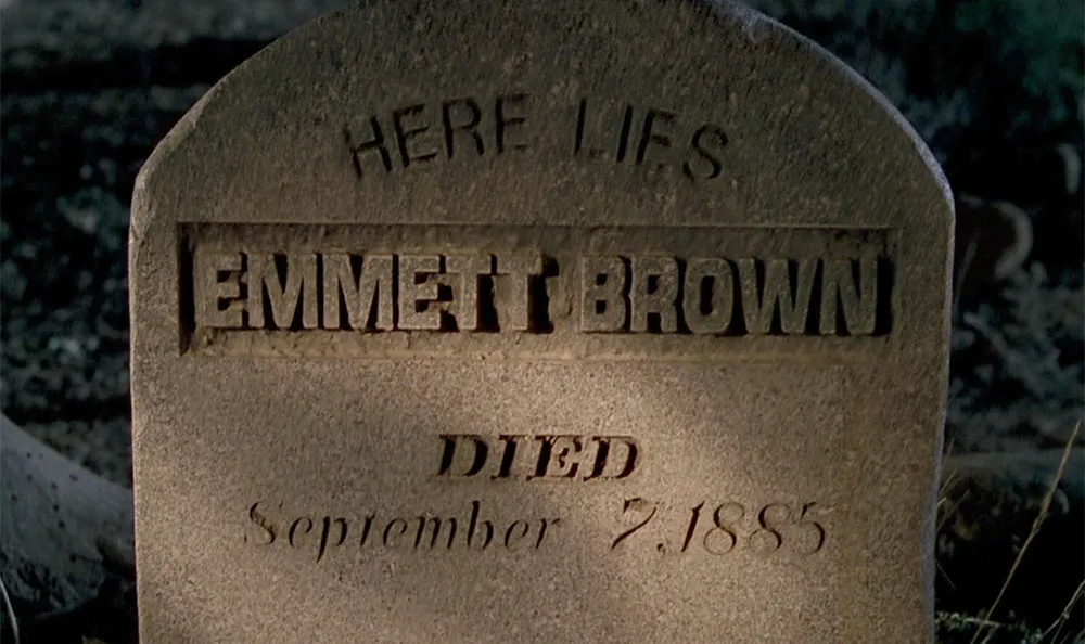
Great Scott!, indeed. It goes by pretty fast and I had to adjust the brightness to see it clearly, but there it is. How did Helvetica (1957, top) and Eurostile (1962, middle) end up on a tombstone in the year 1885? I guess we’ll have to wait for a fourth Back to the Future movie to find out.
Filed under: Son of Typecasting