Sunday March 26, 2006 / Filed under: Personal Archaeology

Let's Talk Type! (1977)

Let's Talk Type!Just for fun, I’ve decided to share my first published writing on the subject of typography. It appeared in the April 19, 1977, issue of Metropolis, the Weekly Newspaper of Minneapolis. Metropolis unfortunately folded about six months later, but it was an incredible place to work. I may write more about it sometime.

As its production manager, I didn’t get much chance to write, but this was one exception. After four months there, I had a reputation as someone who knew something about type. Metropolis had a page in the back called “Final Draft.” It was a page where anything might appear, from short stories to comics to photo essays. I can’t remember anymore if the editor, Scott Kaufer, asked me to write something or if I suggested it myself. Some of it makes me cringe to read again. Some of it is not quite correct. There are things in it that I wouldn’t necessarily agree with anymore, and I am surprised at how jaded I sound. Keep in mind, though, that I was only 21 years old when I wrote it, and, as everyone knows, a 21-year-old knows all there is to know.

With that I present, digitally remastered, “Let’s Talk Type!”

Originally Original

Avant Garde Gothic (shown above) was a typeface designed by Herb Lubalin in the 60’s for a magazine called Avant Garde. All the other designers wanted to use it because it was so “graphic”. After the magazine folded, it was finally released for general use. According to Herb, only one other designer has used Avant Garde Gothic the way it was intended to be used. I guess that makes sense.

Great! Yawn. Next?

Here’s something that happens all the time. A new typeface appears. First, some big ad agencies start using it. Then more and more people become aware of it, and because of the demand more and more type-setting places start carrying it. Before you know it, it’s the most popular typeface in the country. Then, little by little, people get tired of looking at it and the popularity levels off. Around this time, it is “discovered” by mediocre-to-poor designers who proceed to drive it into the ground through over-use. Take the typeface above. It’s called Souvenir, a French word meaning “to remember”. It’s only a few years old, but many designers are already trying to forget it.

The Common Denominator

Here’s a strange thing: substituting big lowercase letters for uppercase letters. It was real popular in the 60’s. Designers thought it made words look more “friendly.” Nowadays, when somebody does this they are immediately sent away for treatment.

A little Swiss to the left, please.

A simple formula for the lazy designer who wants to be successful: Set everything in Helvetica (above); “flush left, ragged right”; don’t center anything; make sure everything lines up with something else and leave plenty of creative “white space.”

Just Say When...

Some lettering artists just don’t know when to stop. Give them a word and they’ll give you a drop-shadowed, outlined, comstocked, shadowboxed, airbrushed, over-embellished, interlocking, pretentious mess that’s so slick you need a pair of vice-grips to keep it from sliding out your hands. This kind of thing is usually used on the covers of boring books trying to become best-sellers.

Swash Schlockery

One of the things that always seems to impress people is the swash. But unless it is done well, it often looks terrible. Beginners usually come up with something like the example above.

Y'know, like...

One of the things that’s like really weird y’know is like y’know the lettering stuff they do in like underground comic books and stuff like that where they kinda relate like to the reader’s consciousness y’know with like typefaces like Windsor and Cooper y’know like really funky sort of ones like that y’know?

Deco-dence

There is a cult that’s been flourishing since the 60’s that is hooked on decorative art of the past, such as Art Nouveau, Art Deco, Art Moderne and so on. The goal is to match, as nearly as possible, the style of a given era. If this is done perfectly, the designer goes into Nostalgic Rapture and becomes a Perfect Then Master.

Going Around in Circles

There are a whole bunch of typefaces, like the one above, that are made up of only circles and straight lines. Nobody knows quite what to use them for, but the type designers keep cranking them out, anyway.

Far Out!

The two words above (“far out”) have been set in two of the thousands of relatively useless typefaces available. Designers design them to please themselves or impress other designers or clients. About the only place they are ever used is in ads for type companies.

Don't read this

One of the most selfish and self-indulgent things a type designer or lettering artist can do is to make words illegible. If you suspect that something you are trying to read has been made unreadable for no apparent reason, don’t read it. It’ll serve them right.

Ampers& Mania

Almost every designer in this country is an ampersand freak. They can’t resist a beautiful ampersand. An ampersand is that strange-looking symbol that comes from the joining of the two letters in the word “et”, the Latin word for “and”. Designers are obsessed with the many variations that are possible. Don’t criticize them for this, though. They would probably come after you with an X-acto knife.

Mark Simonson is this newspaper’s production manager and typologist.

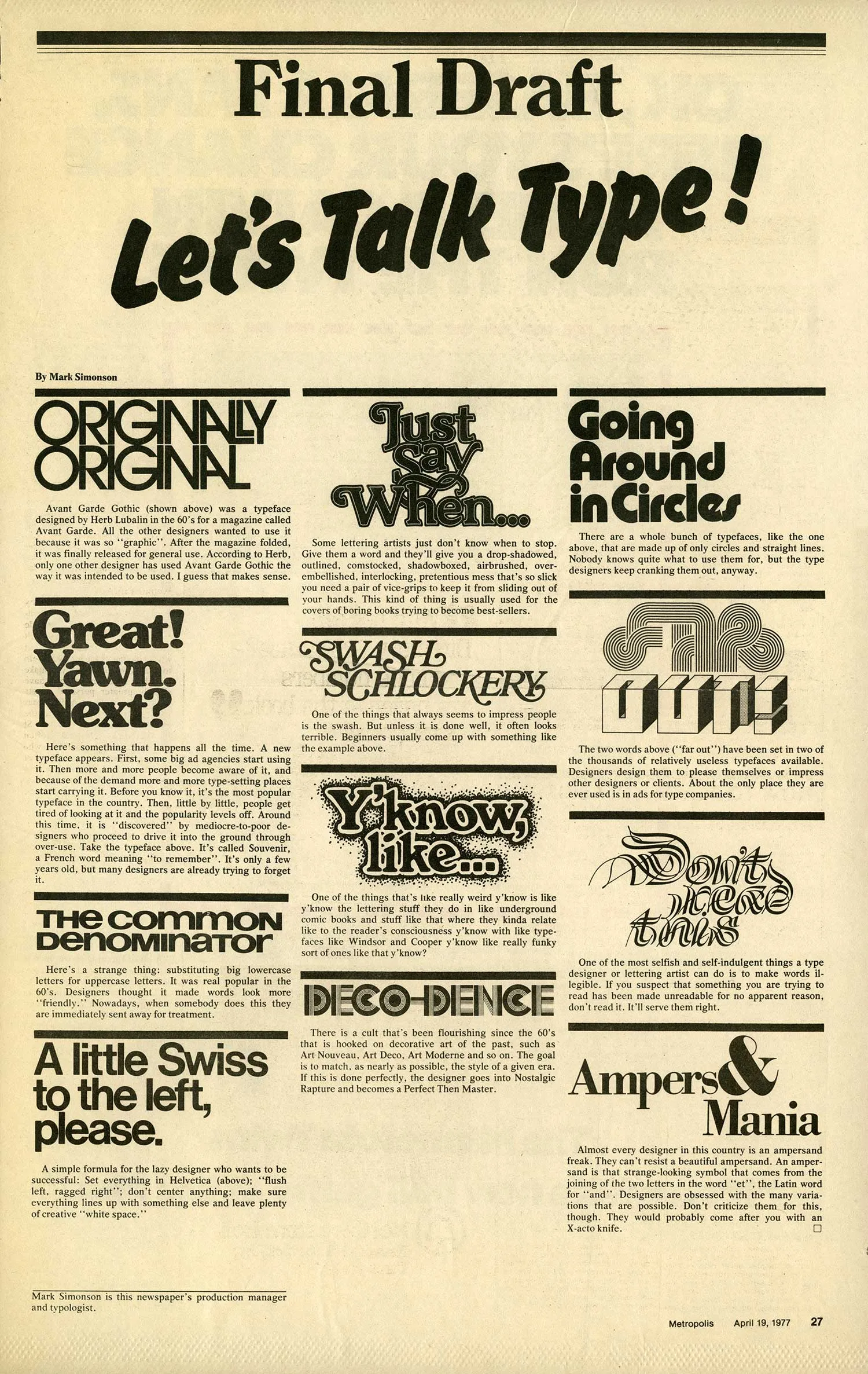
(Originally published in Metropolis, the Weekly Newspaper of Minneapolis, April 19, 1977.)

    Permanent Link

Previous Entry:
Next Entry:

Notebook Index

T-shirts with original lettering designs available here.

Font Index

Lakeside Filmotype Glenlake Kinescope Snicker Blakely Coquette Goldenbook Mostra Metallophile Sp 8 Refrigerator Changeling Sharktooth Felt Tip Roman Felt Tip Woman Felt Tip Senior Kandal Proxima Nova Proxima Nova Condensed Proxima Nova Extra Condensed Proxima Sans Grad Anonymous Raster Gothic Condensed Raster Bank